Reducing the Parish Bulletin to One Page-Two Sides
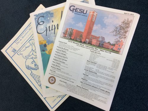
The Parish Bulletin is supposed to be the place where people find out what is happening in the parish each week. It usually contains Mass times and intentions, listings of ministers, schedules, upcoming events, sections for the youth, religious formation, times and locations for group meetings, outings, social gatherings, finances, some pictures, the weekly calendar and then one, two or even three pages of advertisements. The better bulletins typically group all of these under key headings, such as worship, community, formation, outreach and administration. The question is, does it commu-nicate and do people read it? Yes, to some extent, but it could be done differently to attract a wider audience using the website, social media and a parish app, now more common in parishes.
One Page – Two Sides
Instead of a four to eight page spread that covers a wide range of events, schedules, names, finances and letters, what if the parish bulletin changes to a single sheet that gives short introductions to events and happenings, followed by references to the appropriate places in the parish website. It would include lead-ins to stories and upcoming programs, as well as a few small pictures to attract attention and provide color. The intent is to encourage parishioners to read enough on this single sheet to pique their interest. The readers are then invited to go to the parish website for further information.
For example, if the pastor writes a letter each week for the bulletin, perhaps a paragraph or two containing the gist of the message could be included in this short version, leading parishioners to read the full text on the website. Instead of a detailed calendar of events for the week, this new bulletin could name just a few and entice people to explore further on the website. This page might begin with a warm welcome to visitors and newcomers, encouraging them to look to the website for more information and staff contacts. Perhaps each week one of the ministries or parish functions might be featured with a short description, followed by an indication of where to look on the website for more information.
The New Format
Of course, the parish website might need an updated format that could easily guide people to the continuation of stories and events mentioned in the one-page bulletin. It might help to divide it up according to key areas, such as worship that contains Mass intentions, schedules for liturgical ministers and scriptural readings for the week. There might be a section for formation, including school news, baptism classes, RCIA and the like, and a special place for parish and local community events, as well as a section for service and outreach projects and notices. Finally, administration would give people financial information and news on stewardship or maintenance issues.
Taking the Risk
Change is never easy. As a start, people could view the traditional bulletin on the website. Also, there would be little room for advertising in the one-page bulletin which results in a loss of revenue. Perhaps this shorter bulletin could be produced onsite. Hopefully this more focused attempt at communication will show that the parish is a community connected as parishioners take an interest in the content of this shorter version. It is likely that more people will make the effort to follow stories on their phones and computers. Tables outside of the Masses could show people how it works and guide them through it.


